wiikon
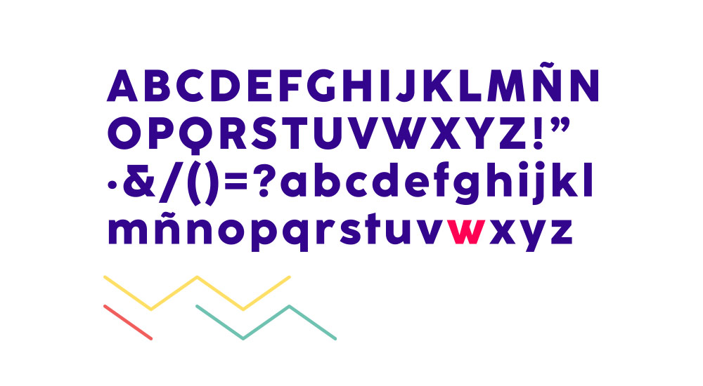
Identidad
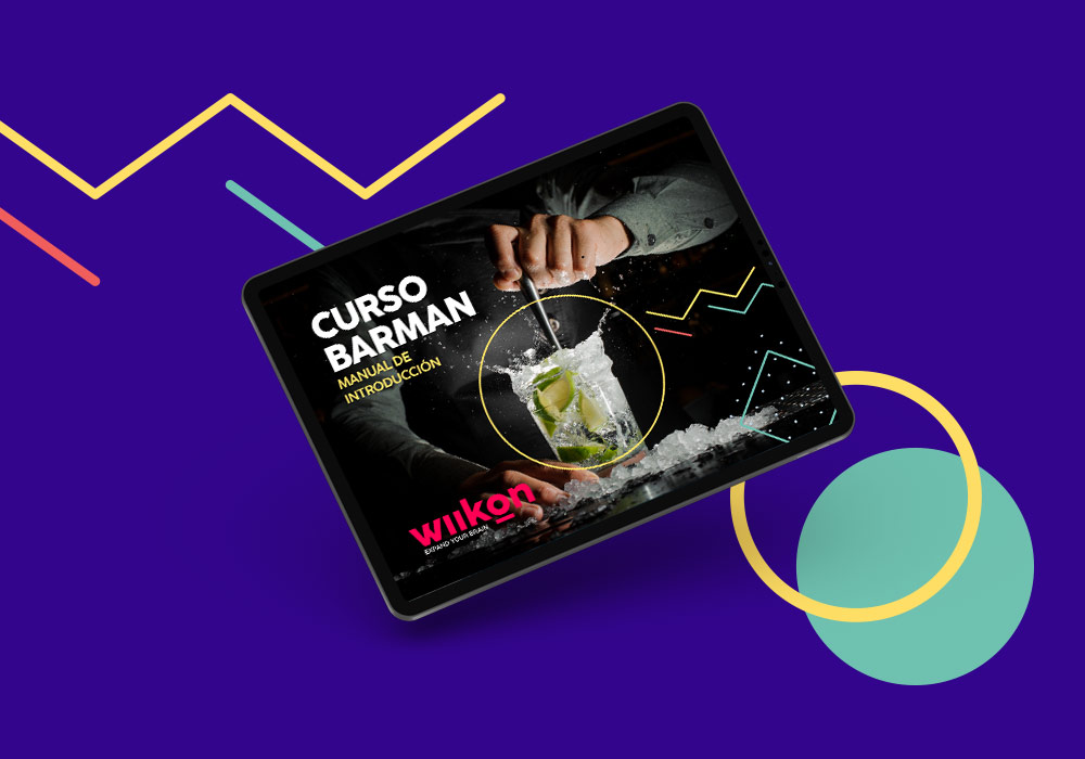
Print
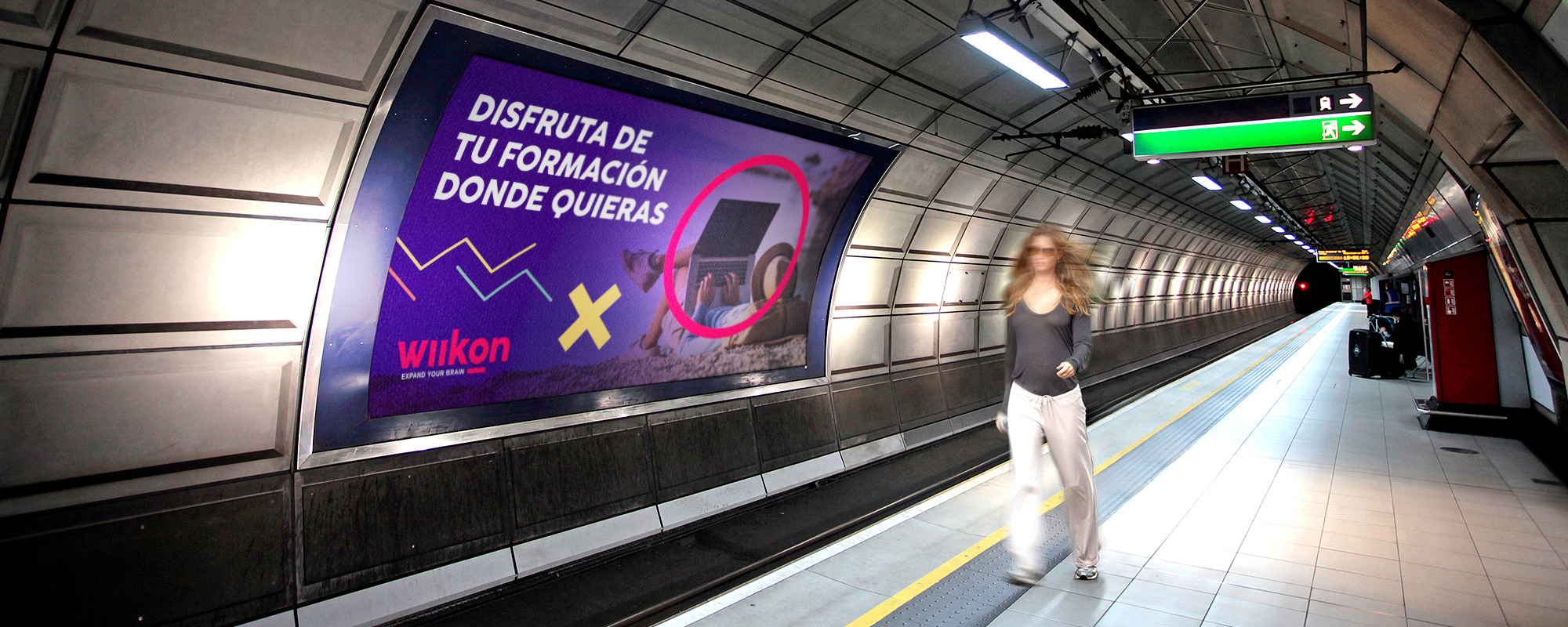
Publicidad
Naming development project and branding design for Wiikon, a different educational online platform concept where you can learn, discover and expand knowledge of very specific subjects thanks to its interesting courses. The objective was an innovative brand that needed a fresh and innovative aesthetic that would connect with its target audience; To achieve this, elements such as sans-serif typography and a contrasting and vivid color palette were used in the branding, which are applied throughout the design of its graphic line.


The style of the corporate identity created is applied to all the elements of the branding, thus maintaining the visual coherence of the brand. To enhance the graphic line and provide dynamism, a series of graphic elements and its own iconology are designed that reflect joviality in its applications.