Argadela
Diseño web
Identidad
Print
All
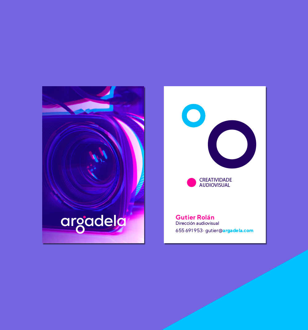
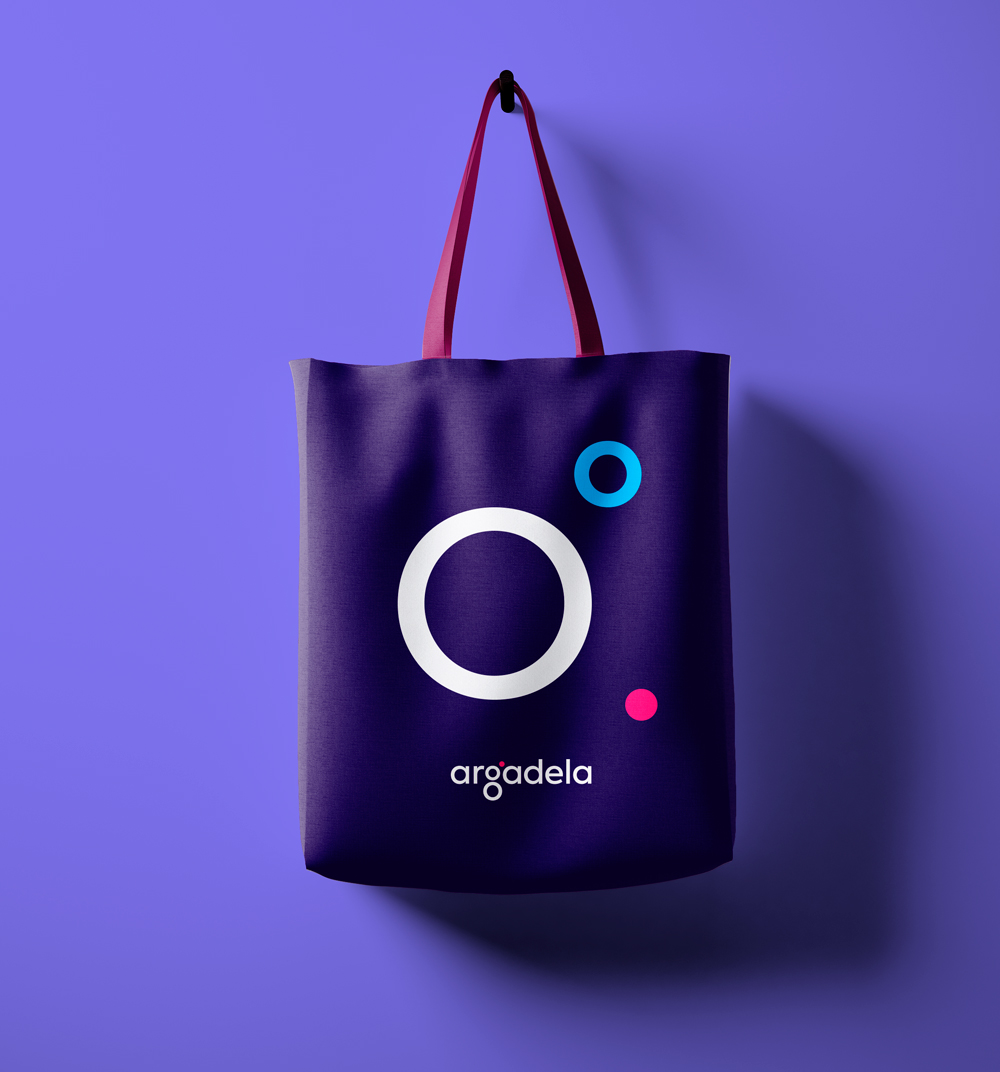
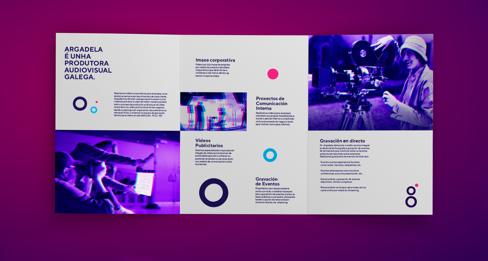
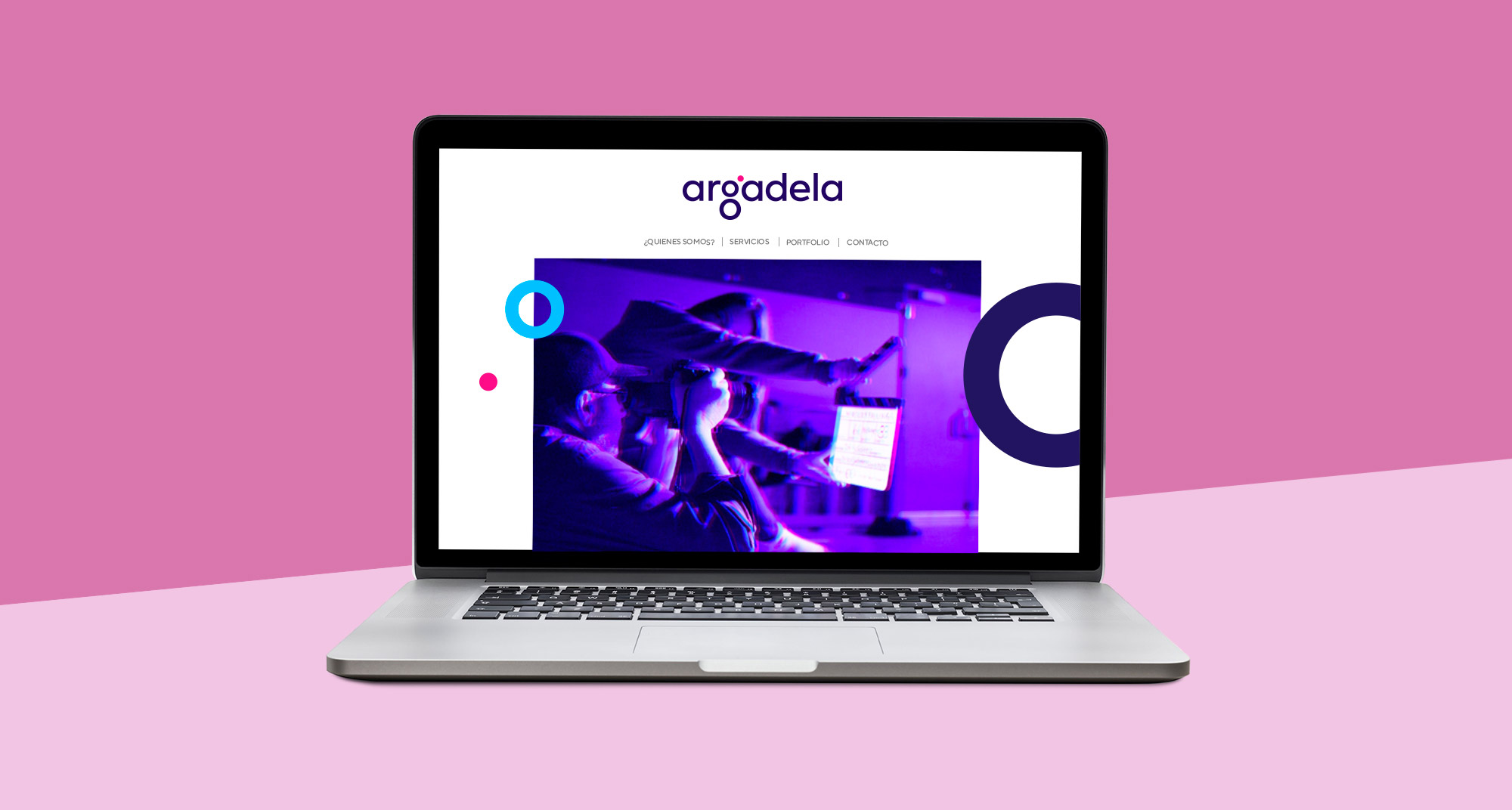
Argadela is a **young audiovisual project created **in A Coruña by Clara and Gutier, two young passionate with their job and professional sector. Their values and philosophy like the streght and feminist energy were important pillars to consider during the brand design creation, as it were to decide with color palette we should use. The well contrasted and powerful colors are spread along all the stationary and applications designed.
During the logo creation, other graphic elements were generated contributing to unify in a single graphic styles the creative and dynamic values so characteristic of the project and their founders.
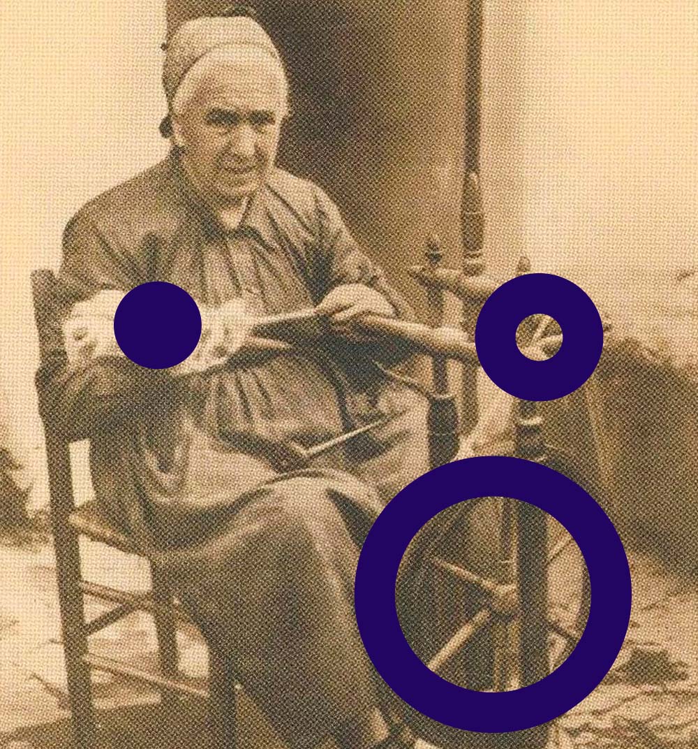
During the brand design process we explore the meaning of the naiming. The word Argadela is a feminine adaptation of "argadelo", a galician word wich refers to a wooden tool which is used to untangle and convert skeins of yarn or wool into balls. This is a simile to the audiovisual creation and production wich takes a lot of initial material and afeter recording and edition transform that material in the final product.
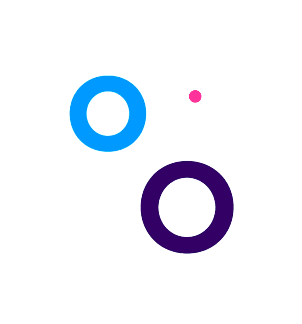
We use basic circles as a graphic element to refer the shape and movements this tool makes while its working.
The final Result is a colourful and striking design associated to strong values, making it a recognizable brand.